

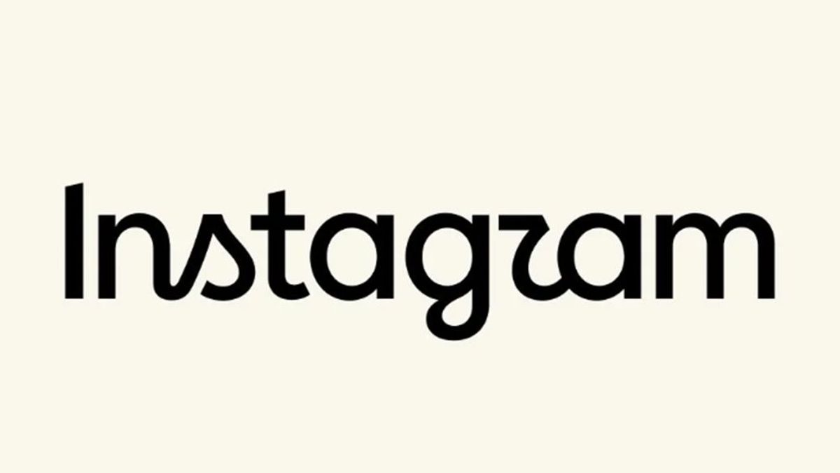
Instagram CEO Adam Mosseri has unveiled an updated text logo for the social network. According to him, the previous style was outdated and required a more modern execution, reports infohub.kz.
For the first time since 2016, Instagram has rebranded its text logo, which appears at the top of the app. The head of the service, Adam Mosseri, presented the updated wordmark, describing the new design as clearer, more concise, and modern, while maintaining a connection to the brand's historical style.
In the new design, designers combined elements of handwritten and printed fonts, adding curves to the letters "s", "r", and "g". Product design director Jasmine Probst noted that the updated version looks bolder and simpler, reflecting the individuality of users. The famous app icon with its pink-purple gradient remains unchanged.
Users have had mixed reactions to the change. In comments, many joke that due to the specific curves of the new letters, the social network's name now reads as "Instagzam". Meta has not yet clarified whether further changes to the service's visual style are planned.